ARIZONA'S BRAND
ARIZONA'S BRAND
STRUCTURE + EXPRESSION
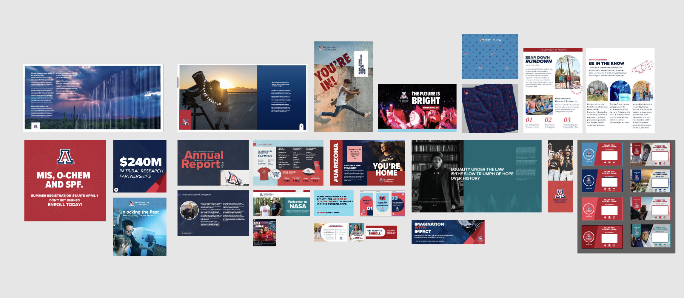
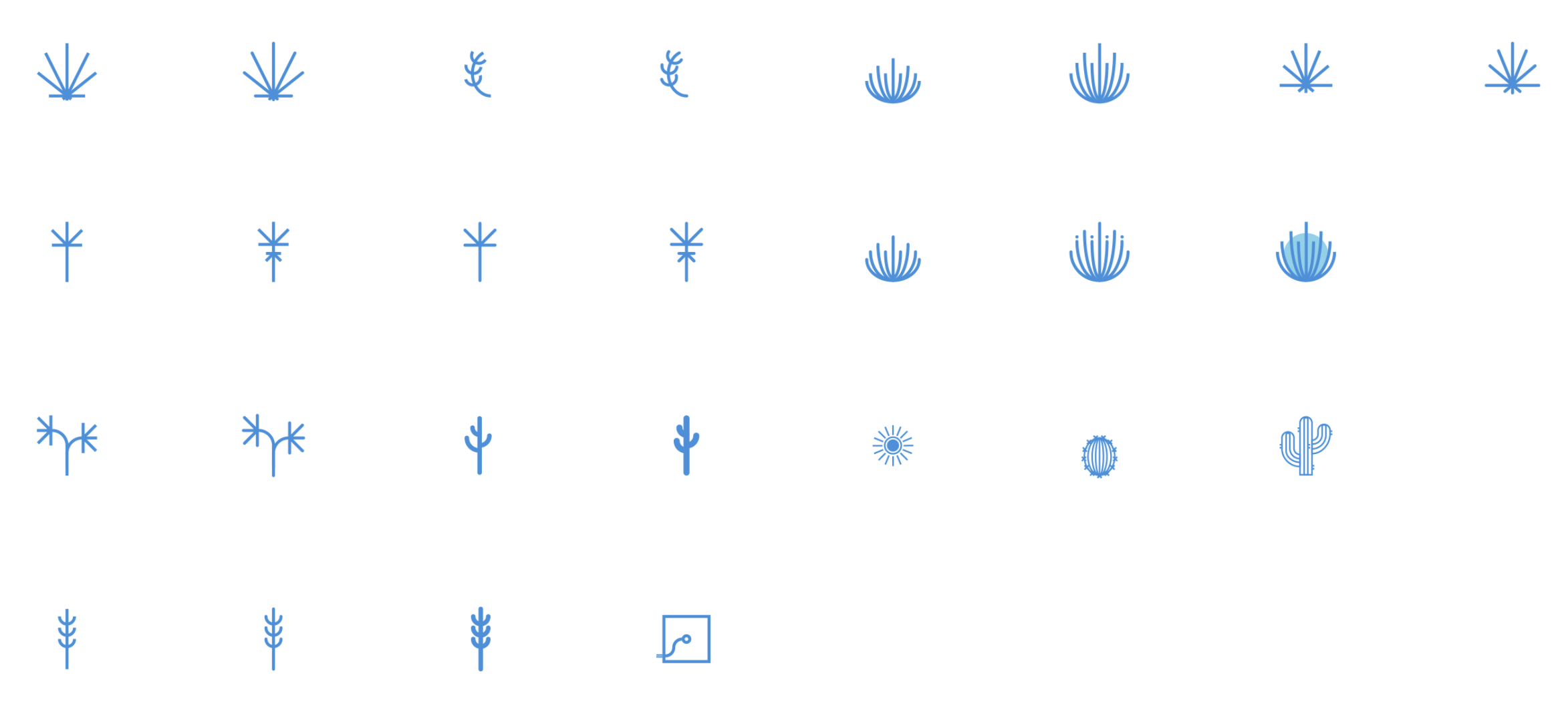
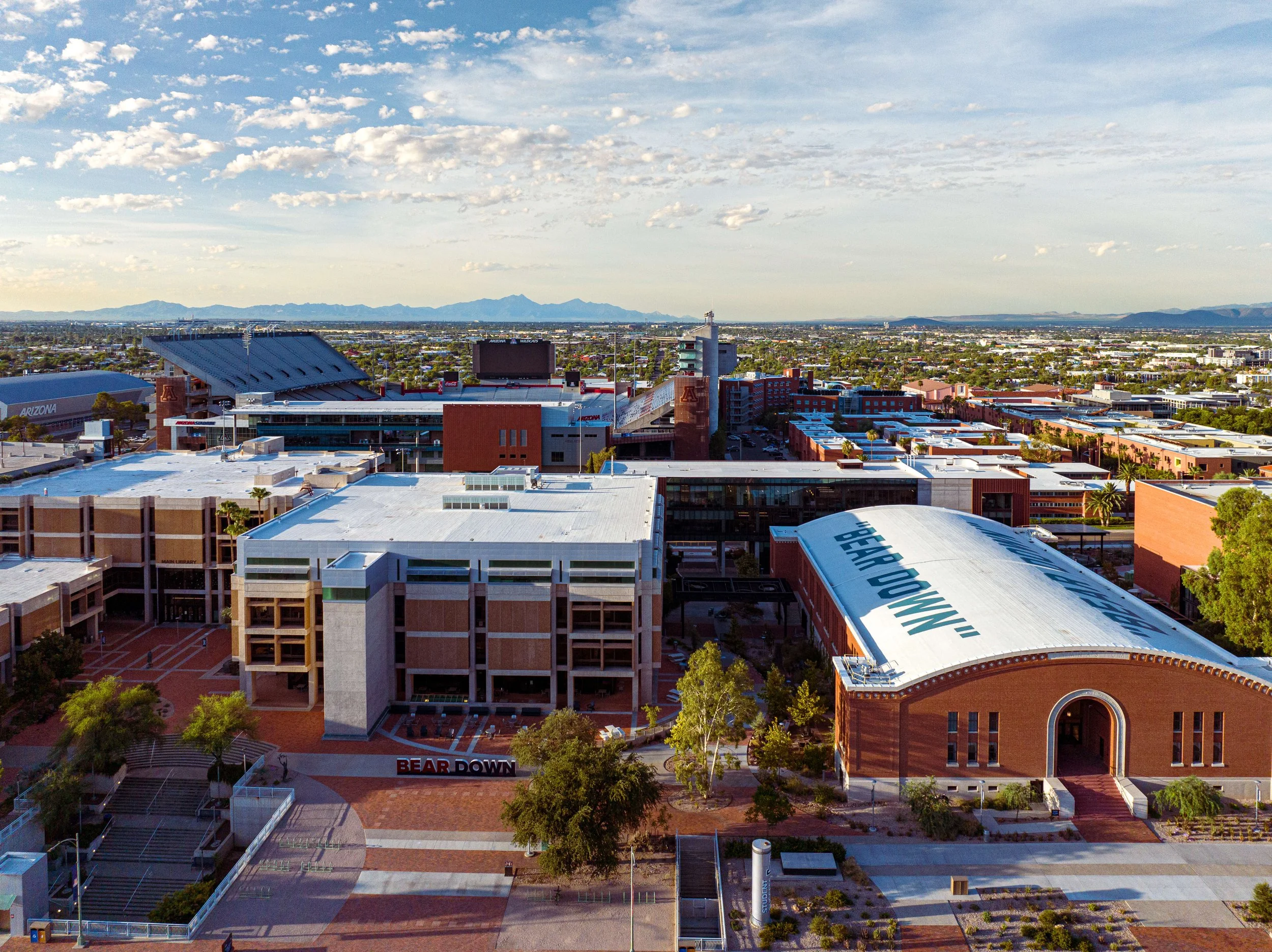
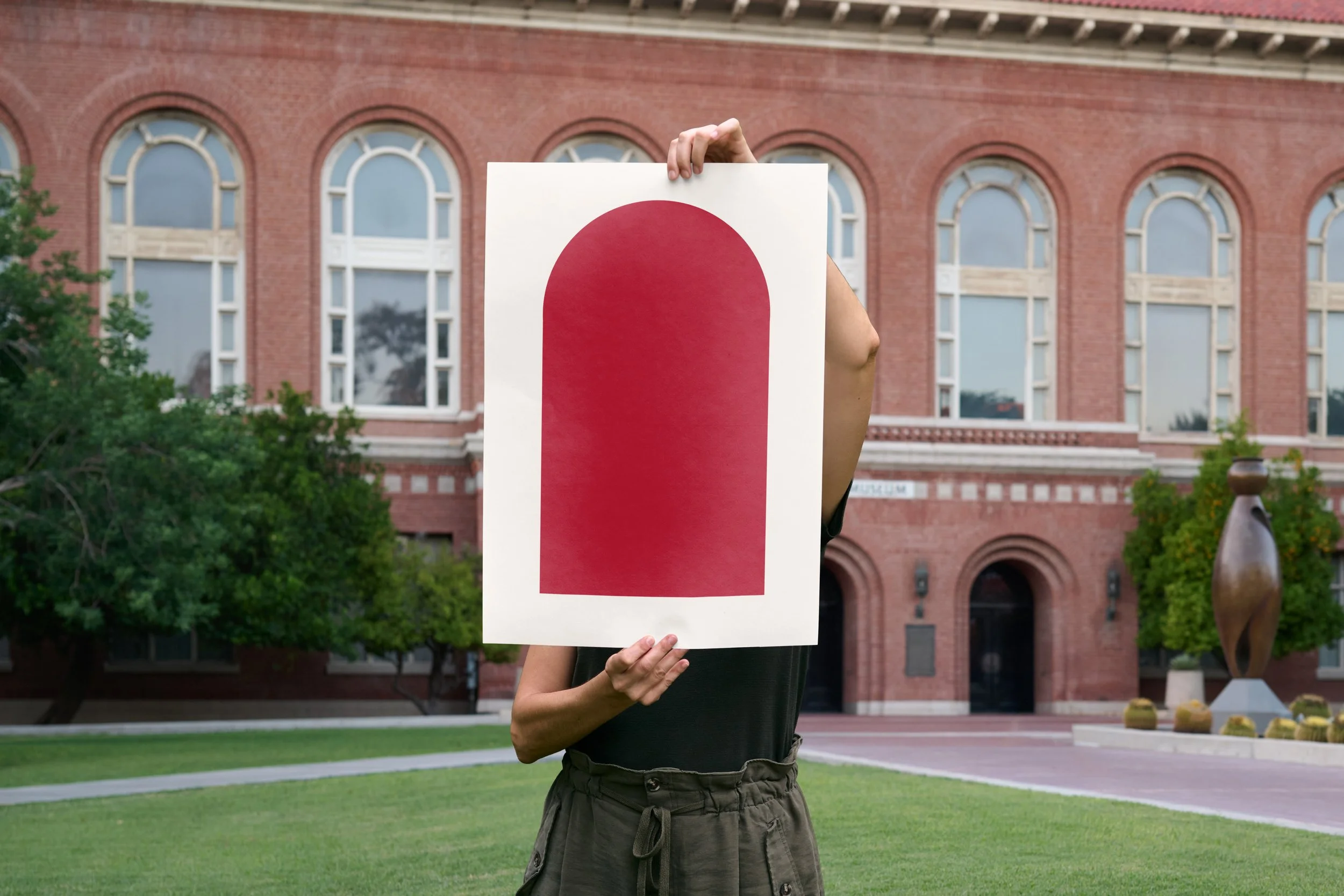
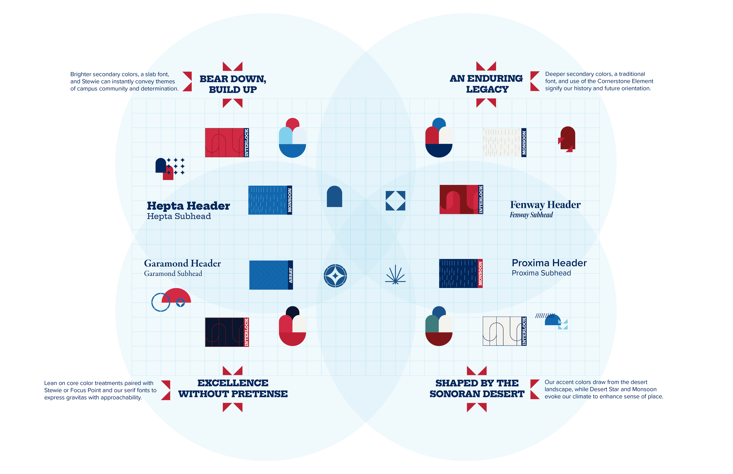
Built through a collaborative, two-year brand development process, this system expands the University of Arizona’s visual identity through a flexible set of graphic assets rooted in architecture, landscape, history, and culture. The goal was not simply to create new graphics, but to build a visual system that could adapt to different stories, audiences, and environments while still feeling unmistakably Arizona.
Design approach: Think in systems, not one-off solutions. Each element was built with a specific visual function—framing, directing, emphasizing, connecting, or creating movement—so the graphics could work independently or as part of a larger composition. This creates more consistency without making every piece feel the same, giving designers a framework to work within while still leaving room for creativity and interpretation.
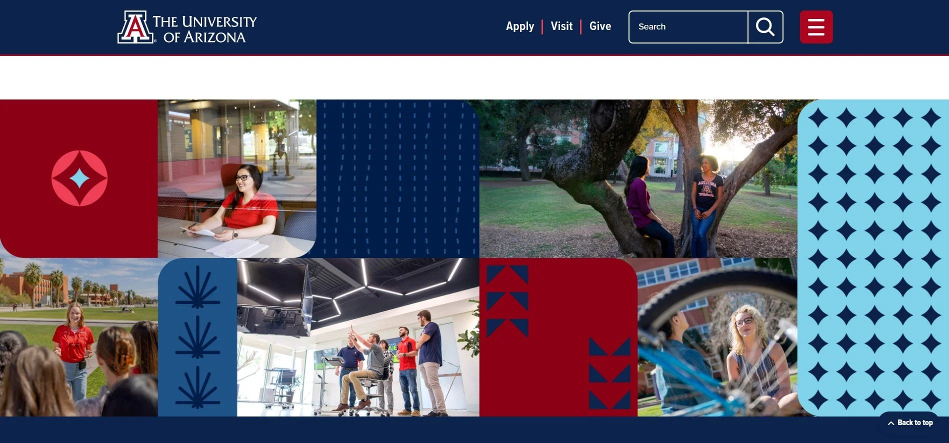
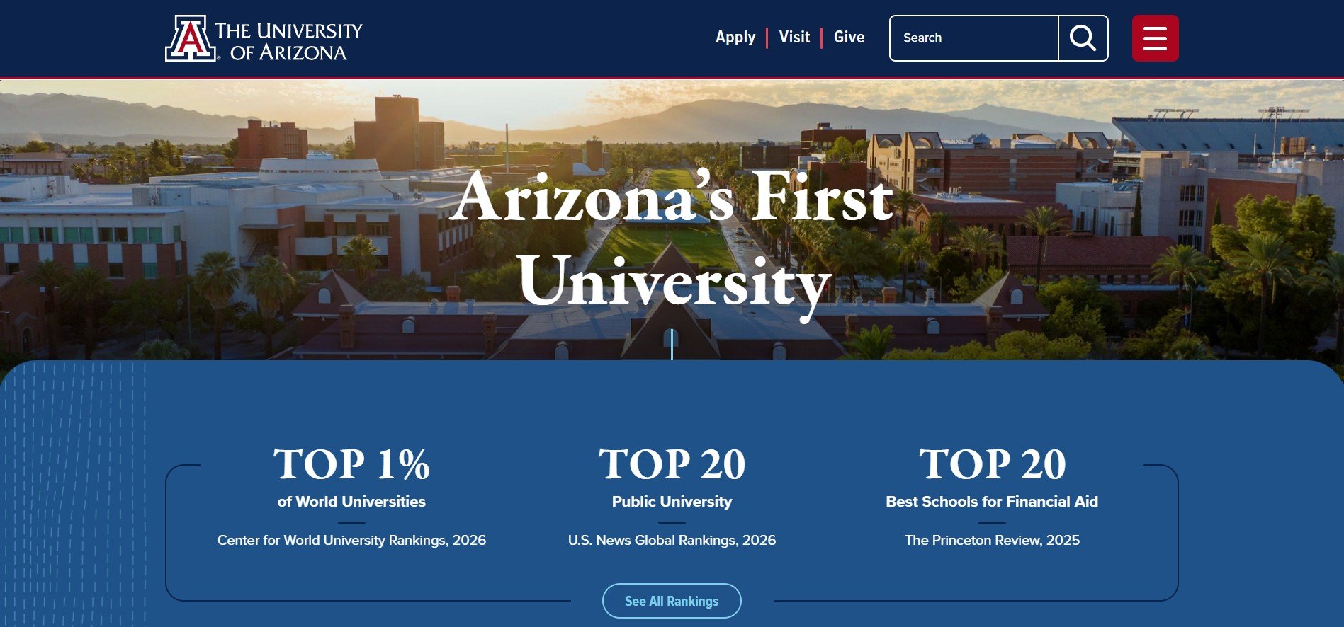
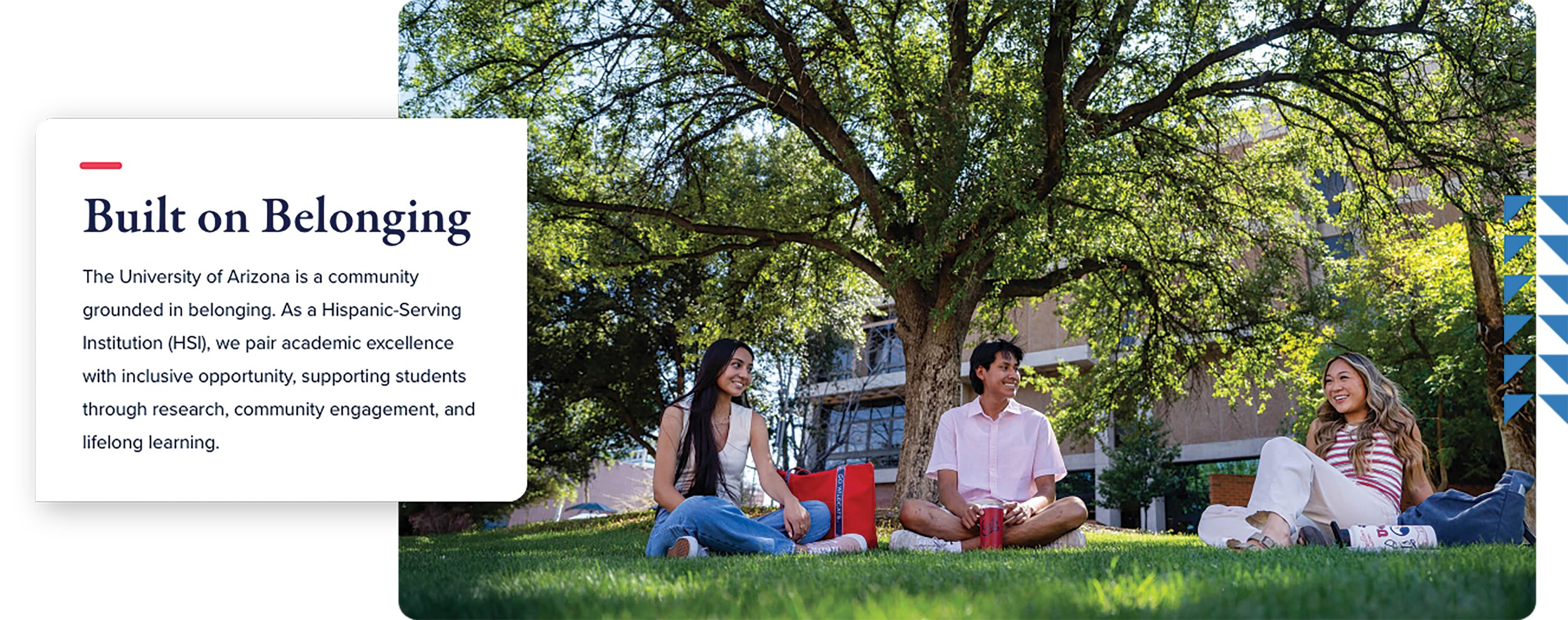
See this work in action at arizona.edu and marcom.arizona.edu



THE TWO-YEAR PROCESS
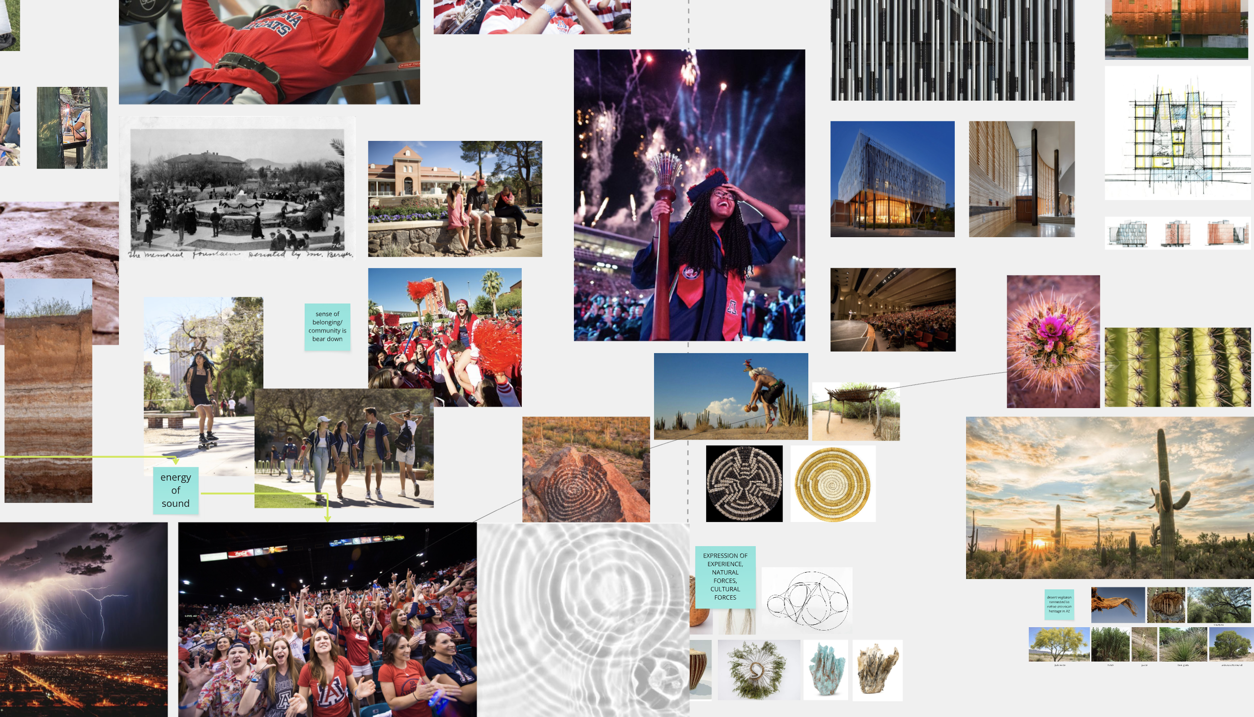
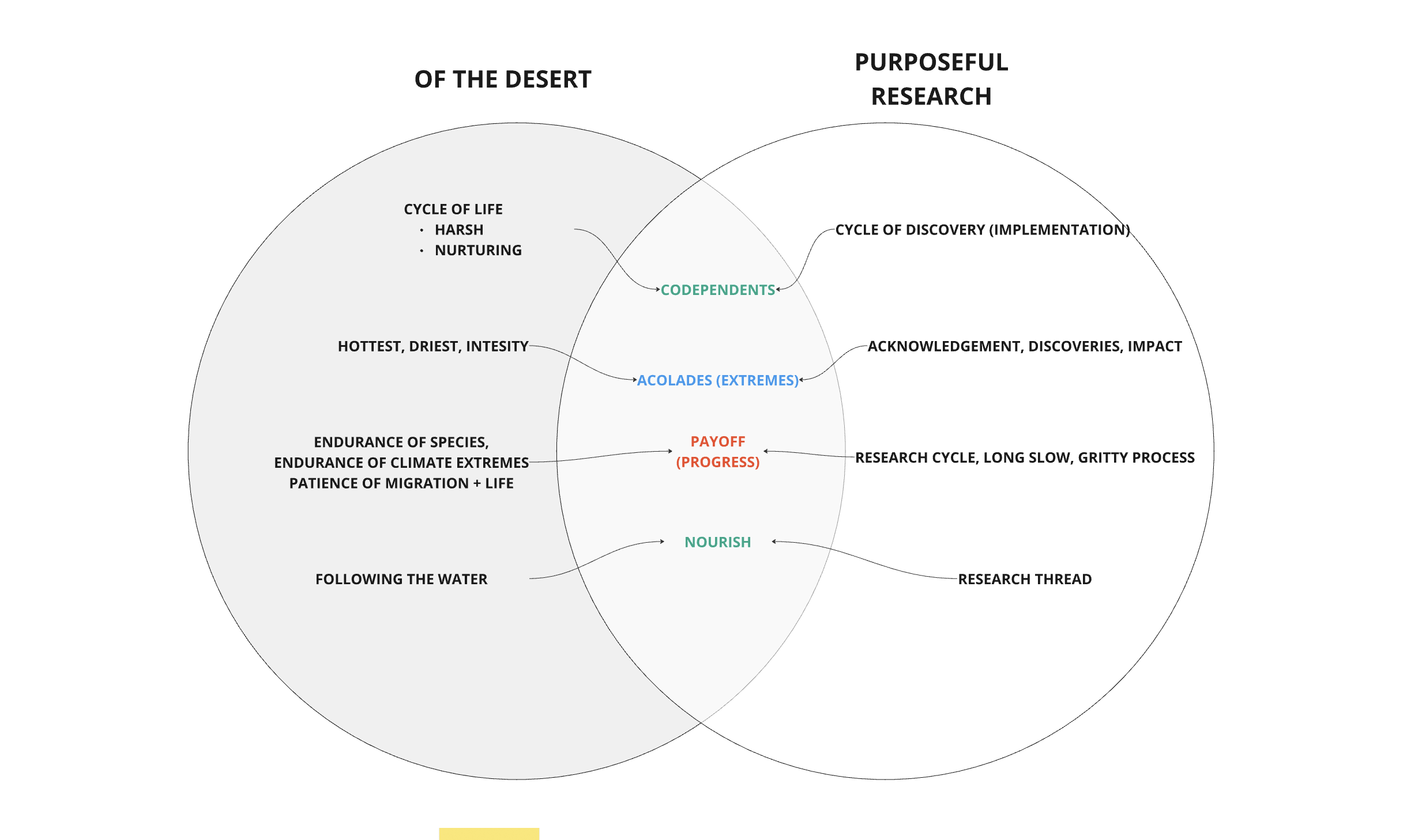
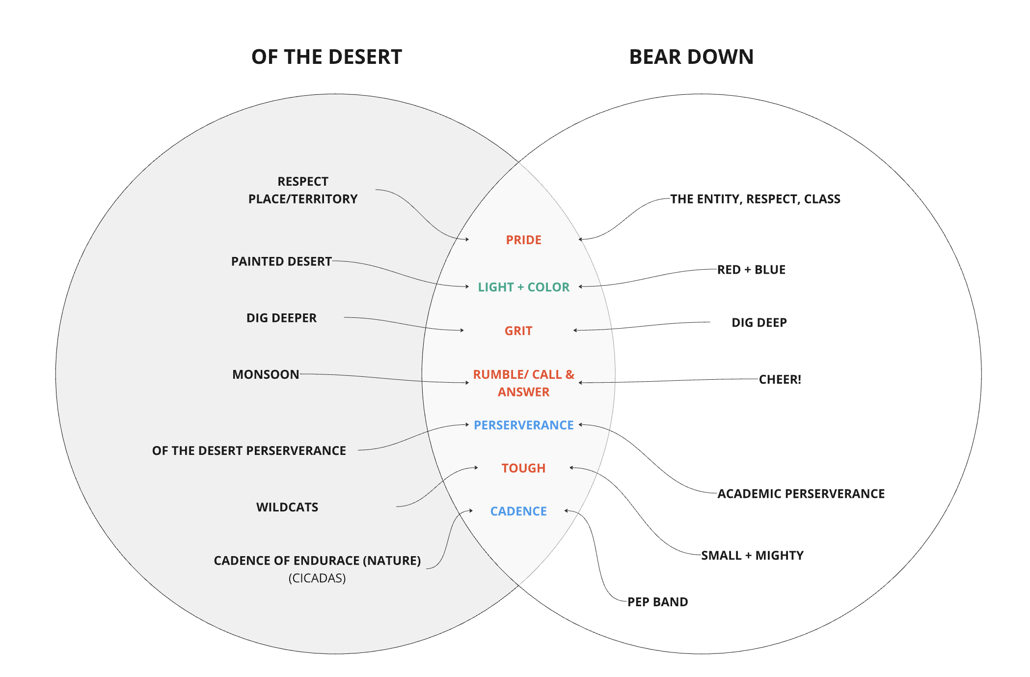
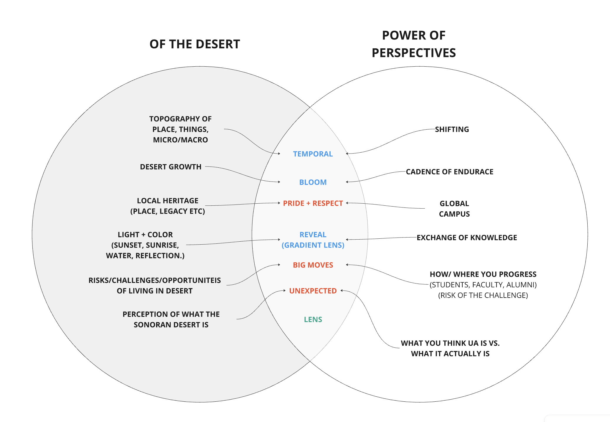
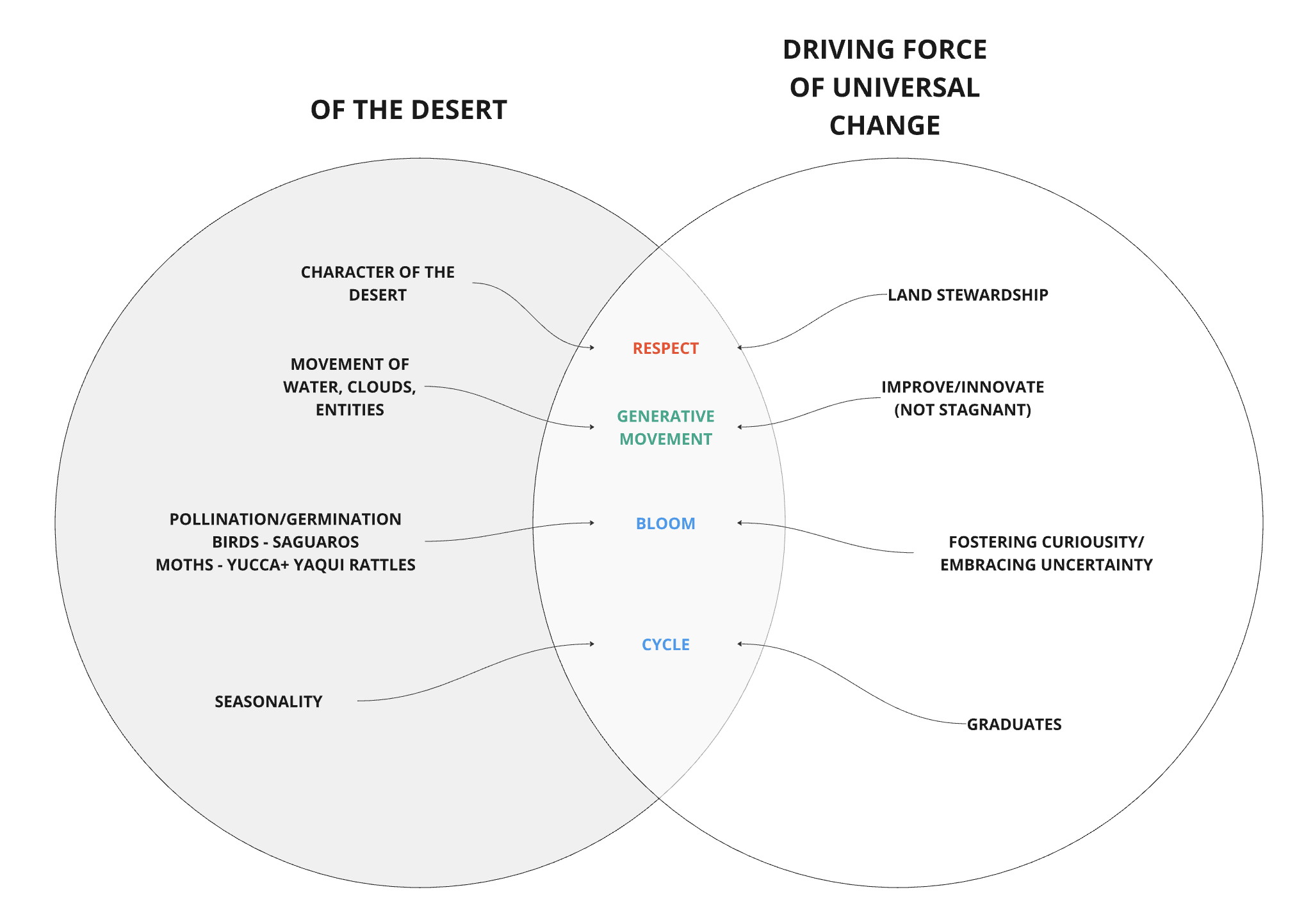
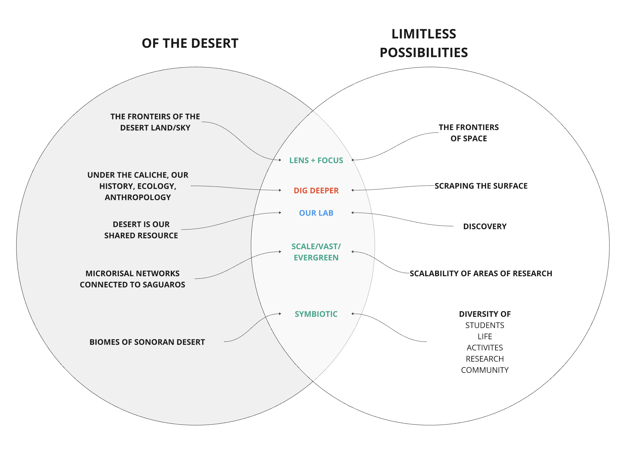
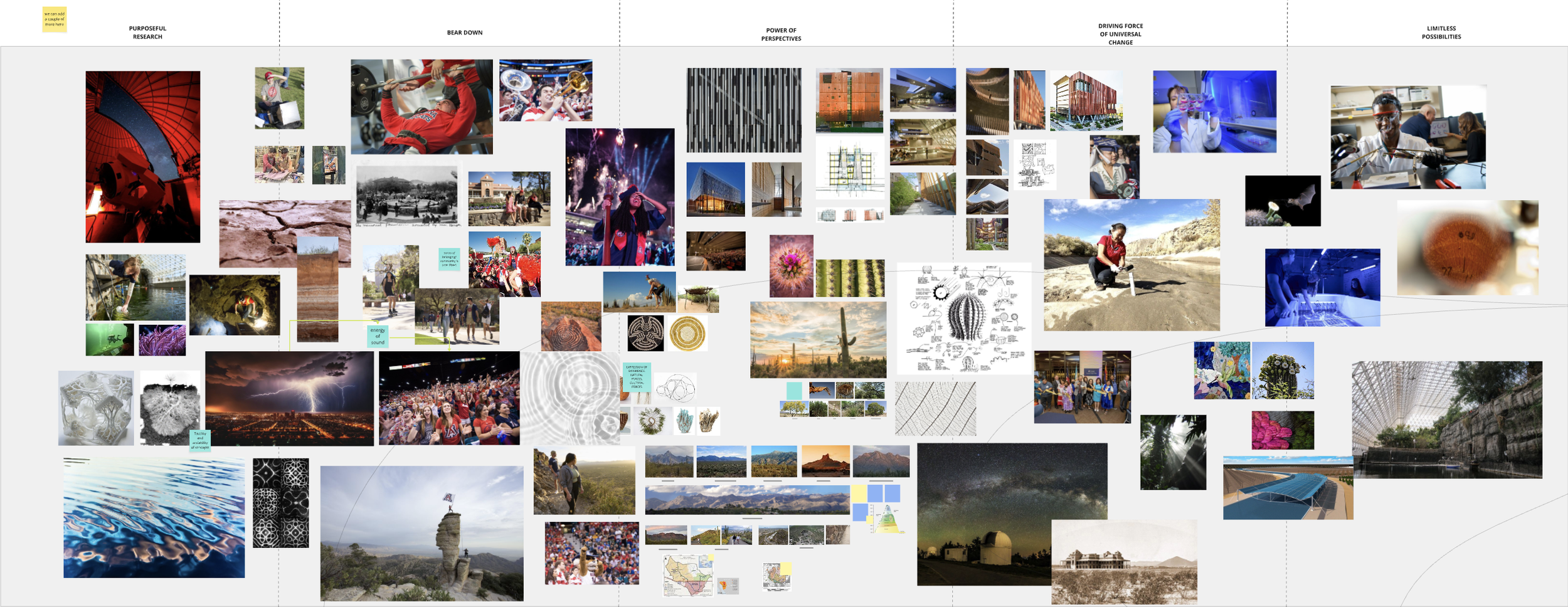
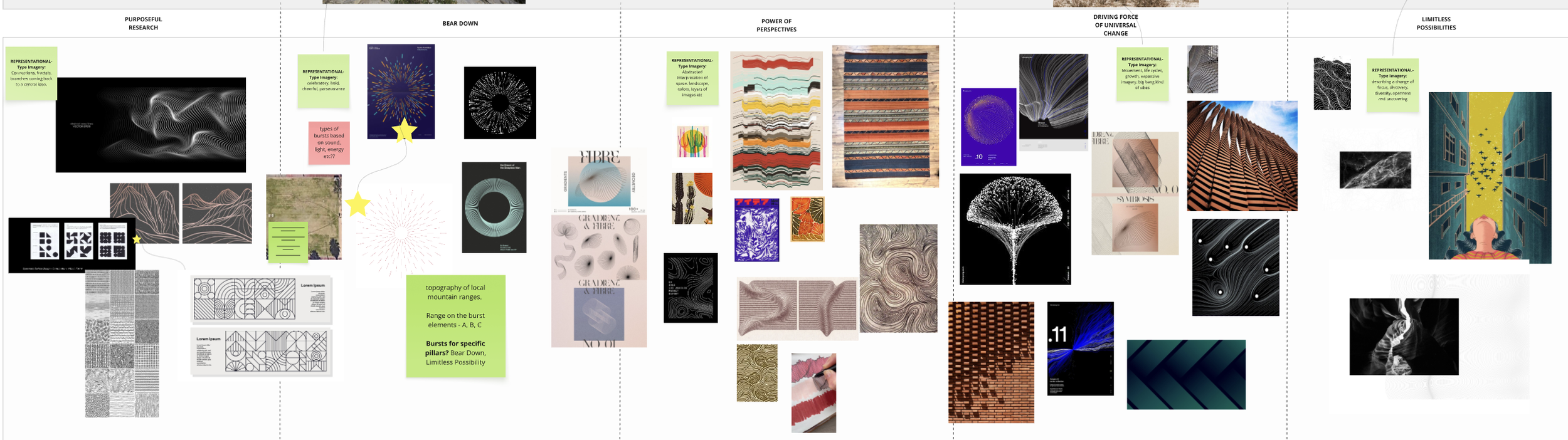
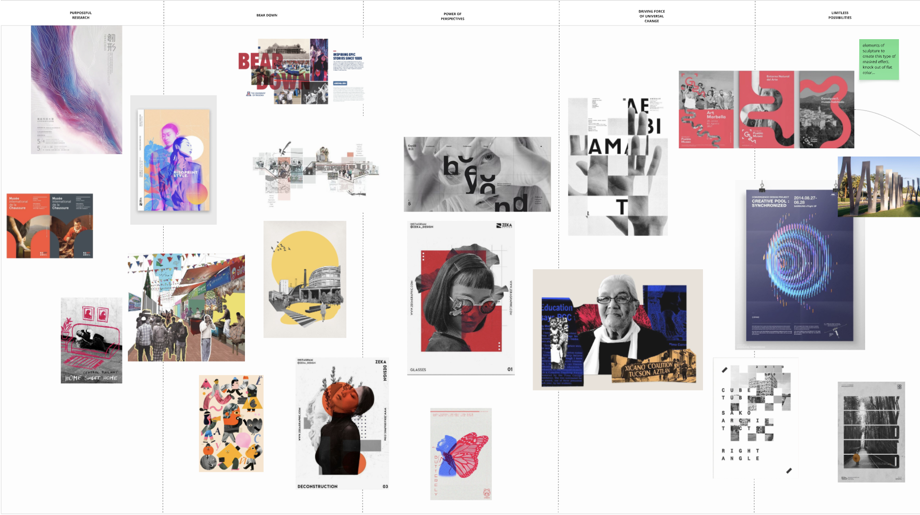
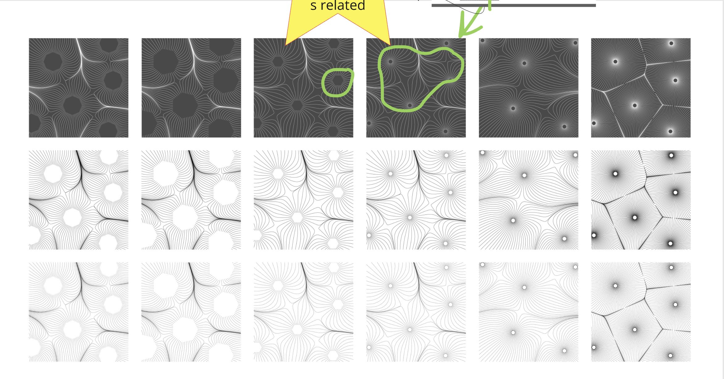
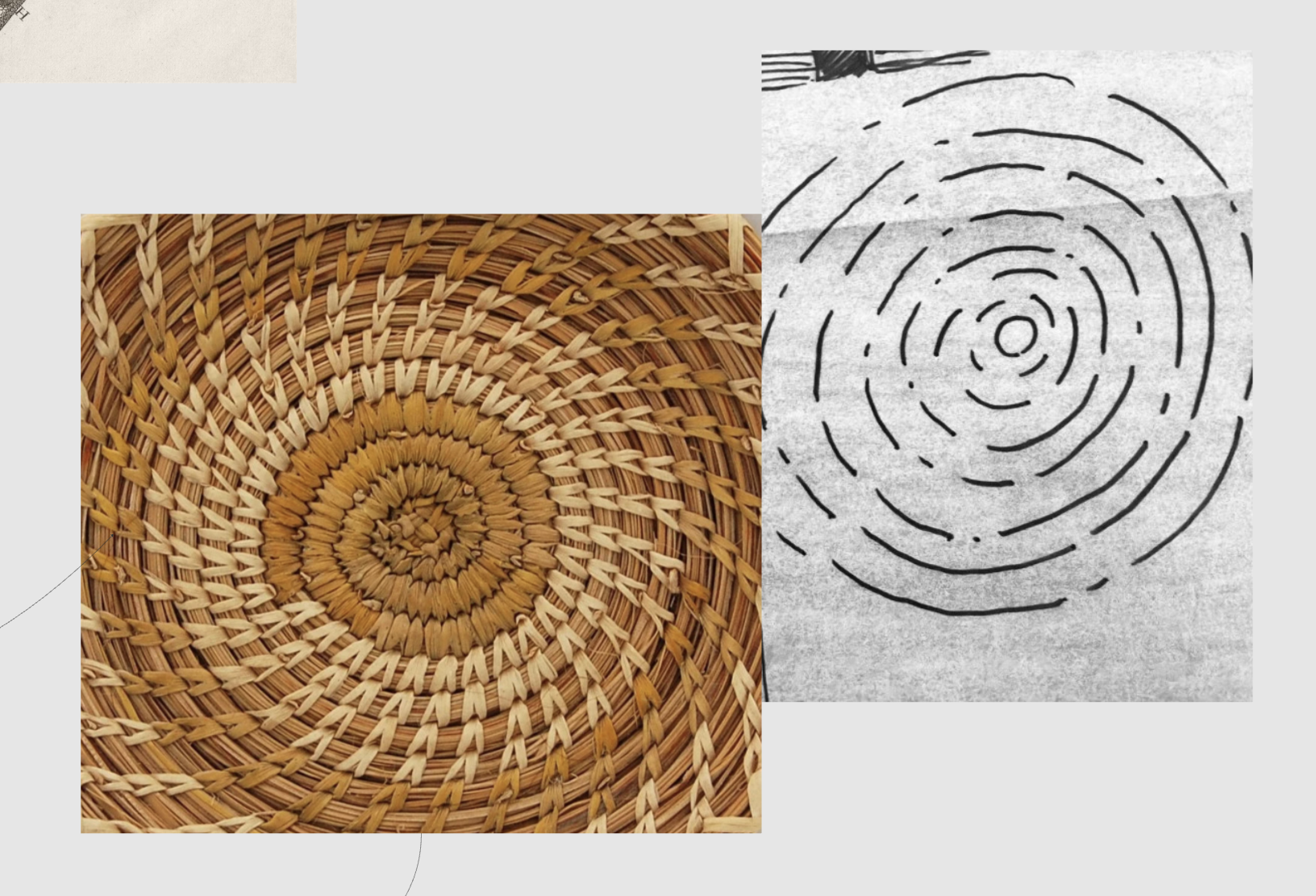
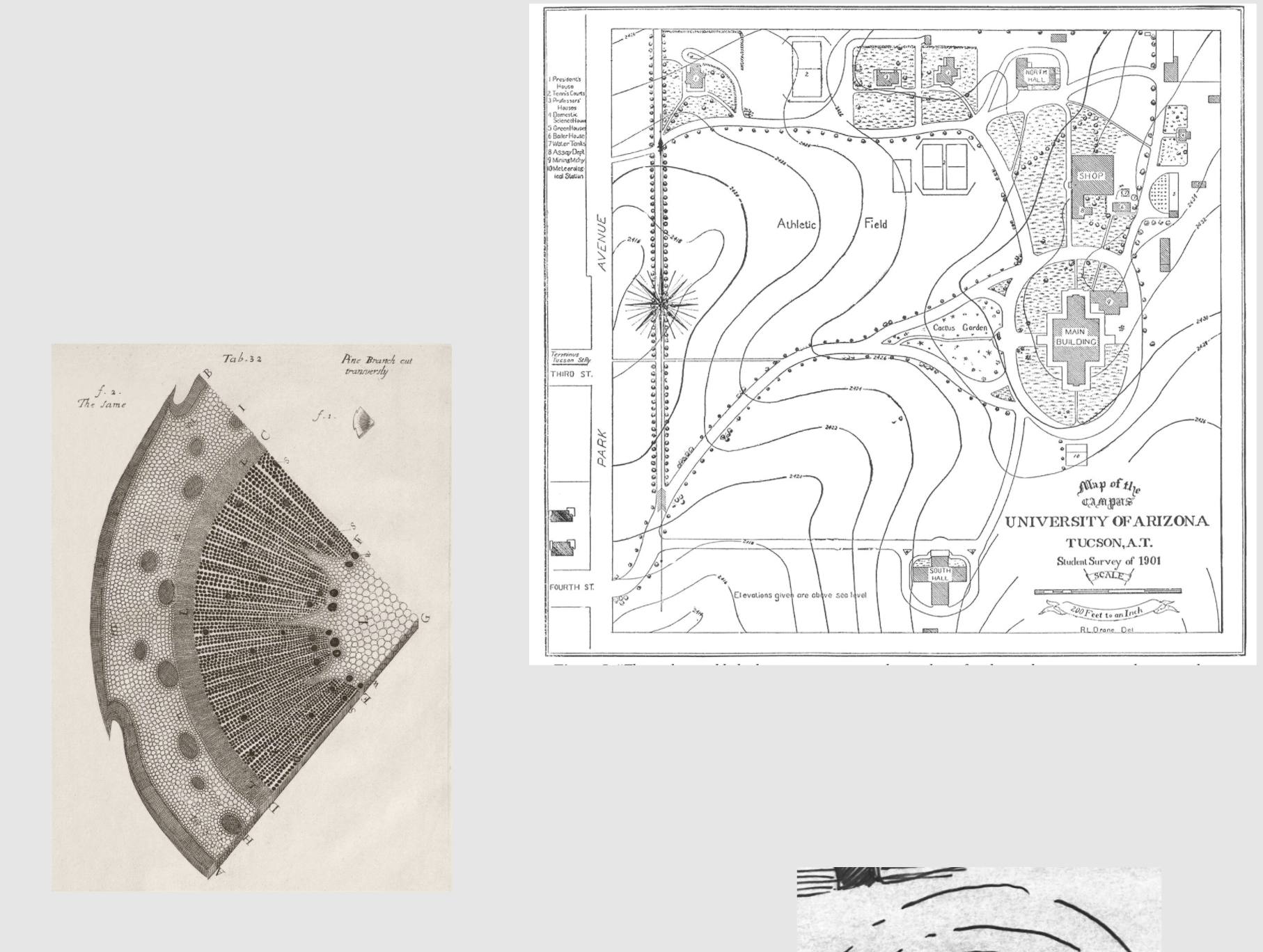
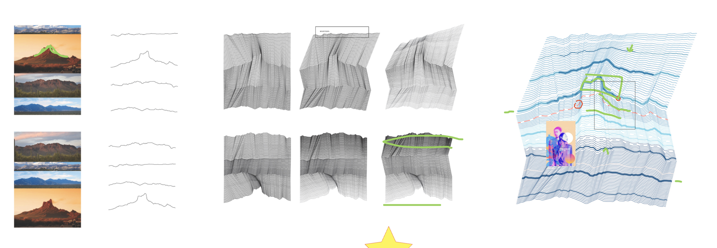
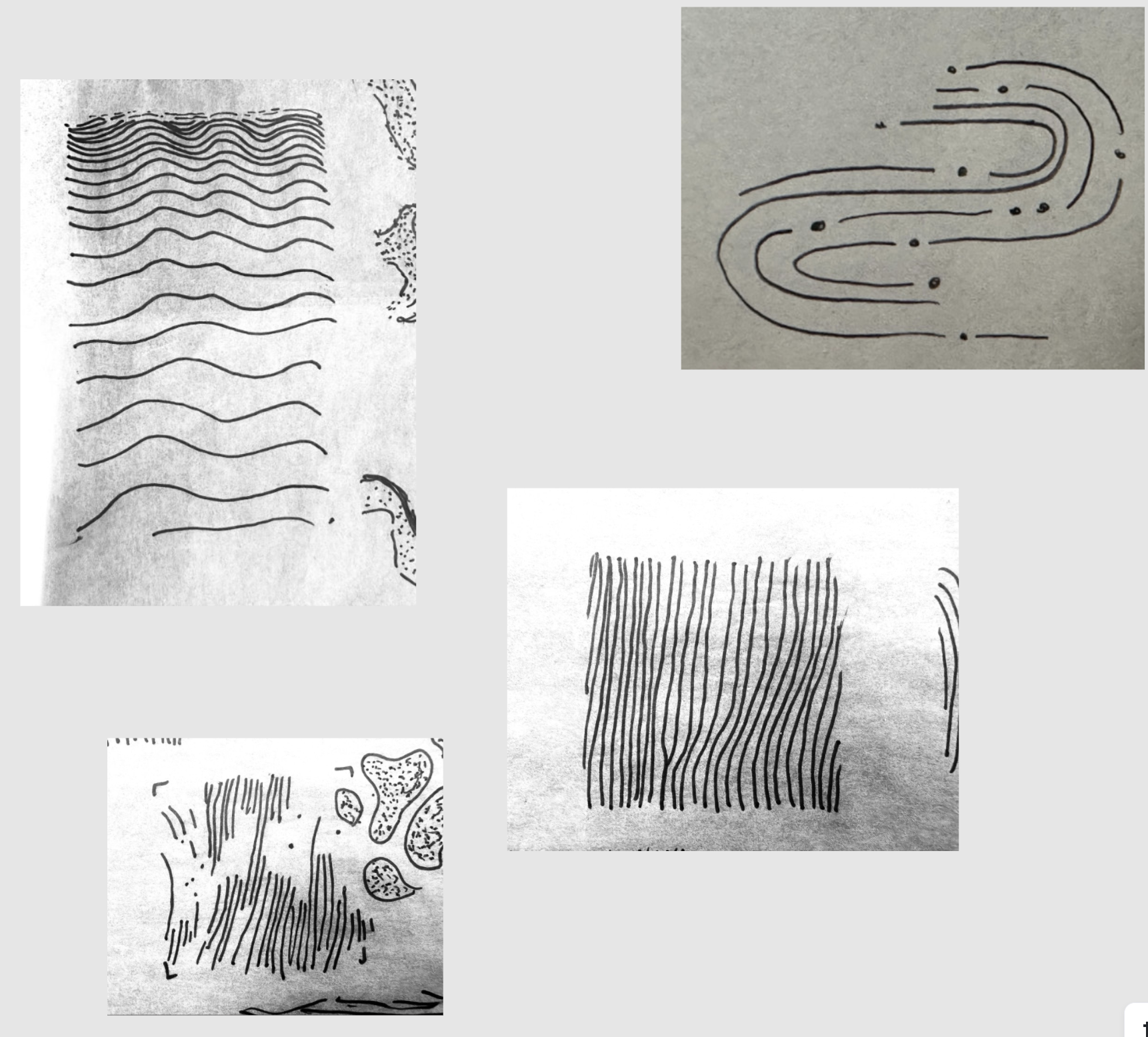
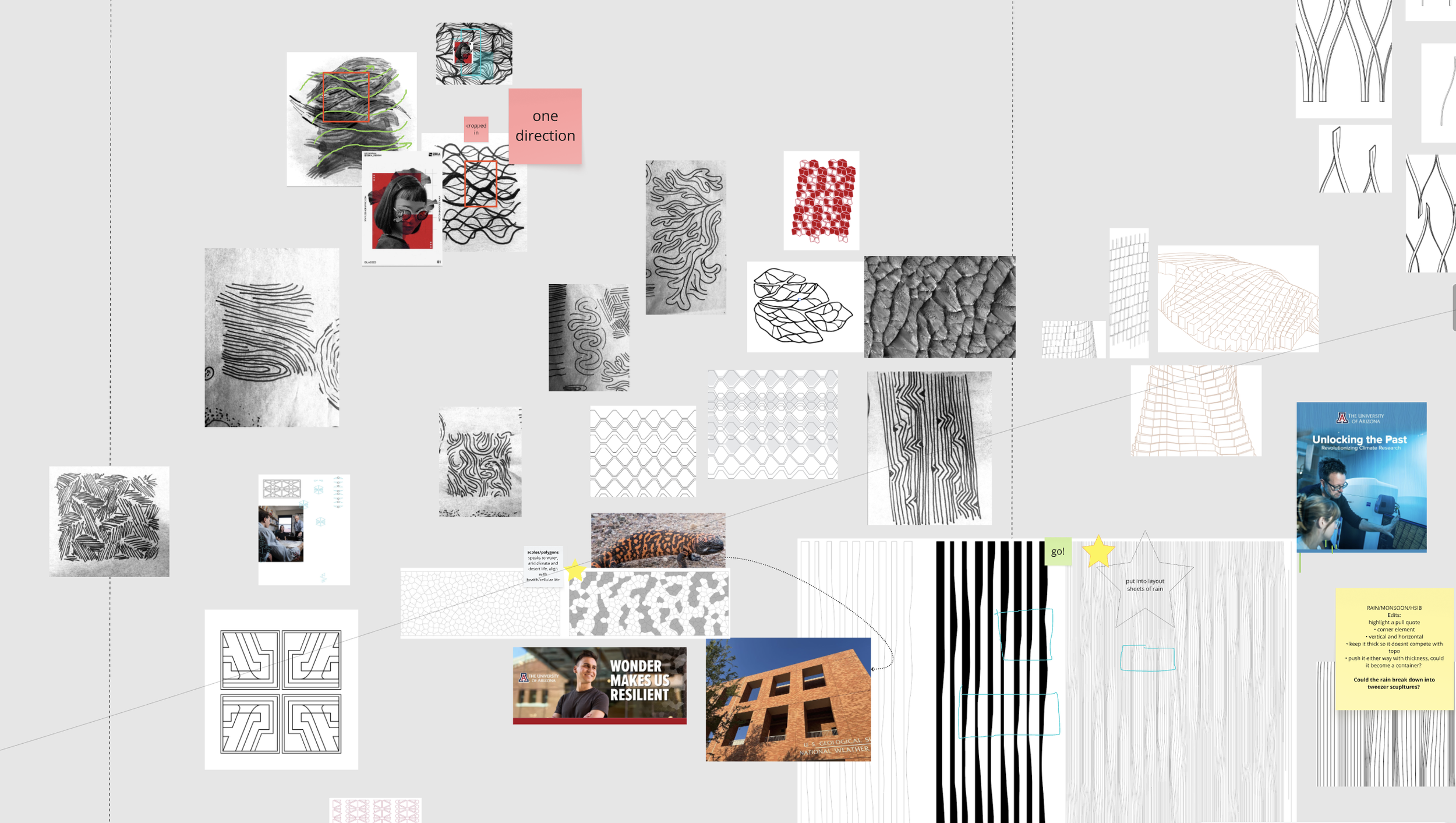
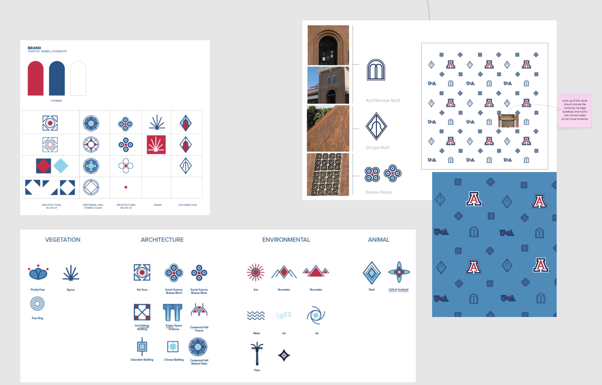
The process began with a close look at the University of Arizona’s core values and brand pillars, using them as a foundation for translating the brand strategy into a visual language. From there, the work was highly collaborative—shaped through conversations, shared references, sketches, iterations, trials, and plenty of experimentation. Ideas were tested, challenged, refined, and sometimes completely reworked as the system took shape. The images that follow are snapshots from that process: inspiration boards, explorations, sketches, and working files that capture the thinking and evolution behind the final assets.